
Unlock Data Secrets with Stunning Visualizations Today
Analytics · 20 Sep 2024
Discover how data visualization empowers data analysts to transform complex data into insightful visuals for better decision-making and storytelling.

Data visualization techniques to explain complex data to non-technical stakeholders with five patterns and examples.
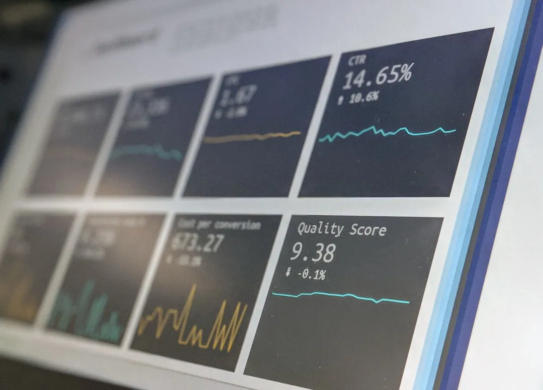
Visualization patterns are repeatable layout and chart choices that simplify complex data for non-technical stakeholders. They turn messy numbers into clear visual stories so decision makers can act with confidence. In Data Analytics Mastery, mastering data visualization techniques helps bridge the gap between analysis and strategic decisions. This article shares five practical visualization patterns, examples from real cases, quick implementation tips, and a short checklist to use immediately. Readers will learn when to use each pattern, common pitfalls to avoid, and how these data visualization techniques improve comprehension and influence. Each pattern is paired with a short case study: e-commerce conversion funnels, monthly revenue trends, customer segmentation, operational outliers, and executive summary dashboards. Examples include chart choices, aggregation rules, labeling best practices, and suggested annotations to make insights obvious. By the end, a data practitioner can confidently pick patterns that match stakeholder needs and business questions. He or she will find actionable steps for building visuals quickly using common tools like Python, SQL-derived tables, or spreadsheet pivots. Overall, the focus stays on clarity, relevance, and story-driven metrics. Not complexity, please.
What is it and when to use it? Aggregated trend lines compress noisy time series into clear directional signals for stakeholders who care about movement over time, not row-level detail. This pattern works well for monthly revenue trends, churn rates, and campaign lift analyses where smoothing reveals the story. A simple line with a 7- or 30-day rolling average reduces noise, while an annotated marker highlights business events like promotions or product launches. Example: an e-commerce team compared daily sessions and conversion rate, then added a 14-day trend line to show the underlying direction after a marketing push. These data visualization techniques used two y-axes with clear labels and a shaded confidence band to communicate uncertainty without overwhelming the audience.
Quick comparison of raw versus aggregated views:
| View | When to use | Pros | Cons | Tools |
|---|---|---|---|---|
| Raw data | Exploratory | Detail | Noisy | SQL, Pandas |
| Daily aggregated | Operational decisions | Timely | Still noisy | Excel, SQL |
| 7-day rolling | Short-term trends | Smoothed | Lag introduced | Python, Tableau |
| 30-day rolling | Strategic review | Clear direction | Masks spikes | Looker, PowerBI |
| With annotations | Executive share-outs | Context-rich | Requires effort | Any charting tool |
Case study: a subscription business used a 30-day trend line with annotations to show a steady increase in LTV after pricing tests, which led executives to increase marketing budgets. Outcome: clearer guidance, faster decisions, and a 12% budget reallocation within two quarters. Proof in metrics.
What is it and when to use it? Small multiples replicate the same chart for several segments, making differences immediately visible without cognitive overload. These data visualization techniques suit customer segmentation, regional performance, product cohort analysis, and A/B test winners across experiments. It replaces dense stacked charts with a grid of consistent axes, so stakeholders scan patterns rather than decode a legend. Example: a retail manager compared weekly sales across five stores using identical small line charts aligned vertically with the same y-axis to reveal store-specific seasonality. Design rules include fixed scales, limited color palette, and a clear sorting order such as rank by performance.
Common uses:
Comparison table:
| Chart Type | Best for | Pros | Cons | Tools |
|---|---|---|---|---|
| Small multiples | Segment comparisons | Easy to scan | Space heavy | Tableau, Matplotlib |
| Stacked charts | Aggregate trends | Compact view | Hard to compare segments | Excel, PowerBI |
| Faceted heatmaps | High-density comparisons | Pattern spotting | Color interpretation | Seaborn, D3 |
| Sparkline grids | Tiny trend context | Space-efficient | Lose value scale | Dashboards, JS |
| KPI panels | Executive summaries | Immediate metrics | No trend detail | PowerBI, Looker |
Case study: a SaaS growth team used small multiples for five customer cohorts and discovered the third cohort had a 20% higher retention after onboarding changes, prompting targeted improvements. They presented the grid to product and customer success in a single slide, and stakeholders immediately saw which cohort required additional experiments.
Outcome: faster identification of winners and losers, clearer prioritization, and a 35% reduction in meeting time because stakeholders could self-serve insights from the grid. Proof: conversion increased by 6% after targeted changes.
What is it and when to use it? Outlier and distribution visuals emphasize spread, skew, and exceptional points so non-technical audiences can grasp risk and variability. Use boxplots for compact summaries, violin plots for density, and control charts for process stability in operations. This pattern is ideal for quality control, fraud detection, support ticket response times, and latency distributions where extremes matter more than averages. Example: an ops team used a control chart to show that 95% of response times stayed within bounds, but four days exceeded limits after a deployment. The visualization combined a boxplot for weekly distributions with a scatter overlay for flagged incidents.
Tool comparison:
| Type | Best for | Pros | Cons | Tools |
|---|---|---|---|---|
| Boxplot | Distribution summary | Compact | Less intuitive | Matplotlib, Seaborn |
| Violin plot | Density insight | Shows distribution | Harder for execs | Seaborn, ggplot |
| Control chart | Process stability | Clear thresholds | Requires assumptions | Minitab, Python |
| Scatter with labels | Incident analysis | Highlights cases | Clutter risk | Tableau, D3 |
| Histogram and CDF | Shape and tail | Comprehensive | Takes space | Excel, Python |
Case study: a payments team visualized transaction amounts with a violin plot and discovered a long tail of low-frequency, very high-value transfers originating from a partner integration. They flagged these transactions and found a misconfigured webhook that duplicated high-value entries, avoiding potential chargebacks estimated at $120K annually.
Outcome: faster anomaly detection, prioritized incident responses, and a 40% reduction in false positives after rules were updated based on visualization insights.
What are they and when to use them? KPI panels present a few top-line numbers for executives, while story-driven dashboards guide stakeholders through a curated sequence of insights. KPI panels suit weekly or monthly reviews where leaders need single-number decisions like CAC, MRR, or NPS. Story-driven dashboards combine visuals, annotations, and short text blocks to lead non-technical stakeholders from context to recommendation. Example: an executive deck opened with three KPI tiles (MRR, churn, gross margin), followed by a trend line, a cohort small multiples grid, and a one-slide recommendation. The combination allowed a CEO to approve a 10% reallocation because the visuals made the risk and upside clear within minutes.
Dashboard comparison:
| Type | Best for | Pros | Cons | Tools |
|---|---|---|---|---|
| KPI panel | Executive overview | Fast decisions | Lacks context | Looker, PowerBI |
| Story dashboard | Decision process | Guided insight | Harder to maintain | Tableau, Domo |
| Operational dashboard | Day-to-day ops | Real-time | Too detailed for execs | Grafana, Kibana |
| Self-serve | Ad-hoc analysis | Flexible | Requires training | Metabase, Mode |
| One-pager | Board meetings | Concise | Oversimplifies | PDF, Slides |
Pattern 5 focuses on narrative flow: context, visual evidence, interpretation, and recommended action. He organizes slides so each visual answers a single question and ends with a one-line recommendation. Example: a marketing report asked 'Did the campaign increase conversions?' followed by a pre/post trend, cohort small multiples, and a cost-per-acquisition KPI. The final slide recommended scaling the channel that showed a 2.5x higher LTV/CAC with a proposed test budget.
These five visualization patterns turn technical analysis into clear business decisions using practical data visualization techniques. They prioritize clarity, relevance, and the stakeholder question above showing every detail. For operational teams, aggregated trend lines and outlier visuals speed incident response and root cause work. For analysts doing segmentation, small multiples reveal cohort behavior and reduce back-and-forth meetings. For leaders, KPI panels and story-driven dashboards deliver concise decisions and recommended next actions. Actionable next steps: pick the pattern that matches the decision cadence, prototype in a spreadsheet or Python notebook, and validate with a quick stakeholder walkthrough. They should also document aggregation rules, smoothing windows, and assumptions so insights remain trustworthy and reproducible. A small experiment: apply one pattern to a recent report, measure decision time and clarity based on stakeholder feedback, then iterate. Over time, these practical approaches reduce meeting length, increase alignment, and surface opportunities that lead to measurable impact. Next, create a tiny playbook with chart templates, color rules, and annotation examples to speed future reporting. Finally, measure outcomes, not vanity metrics, and share wins to build confidence.
Analytics · 20 Sep 2024
Discover how data visualization empowers data analysts to transform complex data into insightful visuals for better decision-making and storytelling.

Analytics · 15 Nov 2024
Discover my top picks for the best data visualization tools that transform complex data into insightful graphics making analytics feel like exploring a map.

Analytics · 11 Nov 2024
Discover how data visualization techniques can transform your decision-making process with real-world insights and practical steps for smarter choices every day.

Analytics · 04 Dec 2024
Discover the 5 data visualization techniques I swear by to make sense of numbers and tell powerful stories just like piecing together a puzzle in everyday life

Analytics · 04 Dec 2024
In my journey with data I’ve discovered fun visualization techniques that bring numbers to life I’ll share ideas that anyone can use to make data relatable and impactful

Analytics · 15 Nov 2024
Discover my favorite data visualization tools including Excel insights that bring numbers to life and help make sense of data like turning complex recipes into delicious meals.

Analytics · 11 Nov 2024
Discover how five powerful data visualization techniques can transform your decision-making process into a clear, actionable roadmap for success.

Analytics · 11 Nov 2024
Discover how data visualization techniques can transform your decision-making process into a smarter, more intuitive journey just like navigating a map in a new city.
Analytics · 11 Nov 2024
Discover how the 5 C's of visualization can transform your data into clear insights for smarter decisions like choosing the right path in a maze.
Analytics · 20 Sep 2024
Discover essential data analysis techniques to enhance your skills as a data analyst and unlock valuable insights from complex data sets.