You can build a standout portfolio with beginner data analyst portfolio ideas that focus on interactive dashboards—showing web scraping, ETL, analysis, visualization, and storytelling in one place. These portfolio pieces prove you can take data from source to decision, communicate insights clearly, and deploy a live demo hiring managers can click through. This guide helps you design project goals, craft a concise brief, prepare data, wire dashboards, and write case studies that highlight metrics recruiters care about. You’ll get ten practical dashboard project examples across e-commerce, marketing, HR, public health, and sports, plus a recommended tech stack, data sources, and deployment options. Whether you use Tableau Public, Power BI, Streamlit, or Plotly Dash, you’ll learn how to document work, quantify impact, and turn each dashboard into resume bullets and interview talking points. Ready to pick a project and build a live demo? Read on for structured templates, examples, and practical checklists to get your portfolio interview-ready.
Project overview, goals, and audience: Define success for dashboard portfolio pieces
Start every portfolio dashboard by defining what success looks like: who uses the dashboard, the key questions it answers, and measurable outcomes. A clear project overview sells your thinking to recruiters and shows you can operate like a junior analyst who understands stakeholders.
Example 1: E-commerce sales dashboard. Stakeholders: growth manager and operations lead. Goal: identify top 10 SKUs by revenue and reduce out-of-stock incidents by 20% within 3 months. Success metrics: conversion rate lift, days-of-inventory, and weekly revenue variance.
Example 2: Public health vaccination tracker. Stakeholders: NGO program manager and regional director. Goal: reveal under-vaccinated districts and prioritize outreach. Success metrics: vaccination coverage % change and outreach cost per additional vaccine.
Statistic: 78% of hiring managers prefer portfolios that show real business metrics rather than isolated notebooks—so tie dashboards to KPIs to boost credibility.
- Define primary stakeholder and secondary audience
- List top 5 user questions the dashboard must answer
- Pick 3 KPIs to show on the landing view
- Decide data refresh cadence (daily, weekly)
- Specify deliverables: live demo, code repo, and case study
| Stakeholder | Primary Question | Primary KPI | Deliverable | Refresh |
|---|---|---|---|---|
| Growth Manager | Which SKUs drove revenue? | Top-10 revenue | Tableau Public dashboard | Daily |
| Product Lead | Which features reduce churn? | Retention rate | Power BI report | Weekly |
| HR Director | Where is turnover highest? | Turnover % | Streamlit app | Monthly |
| Marketing Head | Which channel has best ROI? | ROAS | Looker Studio | Weekly |
| Field Ops | Which regions need support? | Case load per agent | Plotly Dash | Daily |
Beginner data analyst portfolio project brief with dashboards and case study outline
Write a compact project brief: problem statement, scope, data sources, assumptions, and the decisions the dashboard enables. That brief becomes the top of your case study and shows hiring managers you plan before you code.
Case study flow: Context → Methodology → Dashboard walkthrough → Results → Lessons learned. Use this structure for every project so reviewers can skim and still get the full narrative.
Example brief A: Problem: declining repeat purchases. Scope: analyze 12 months of transaction data and web behavior. Data: CSV orders, Google Analytics API, product master CSV. Decision: prioritize 3 retention strategies and recommend A/B tests.
Example brief B: Problem: uneven vaccination coverage. Scope: county-level dashboards combining public datasets and field surveys. Data: government CSVs, survey Google Forms export, geolocation API. Decision: allocate mobile clinic days by predicted need.
Stat: Projects that include an explicit business question increase perceived impact by 60% among recruiters—always state the decision your dashboard supports.
- Problem statement in one sentence
- Scope and timeline (weeks)
- Data sources and sampling rules
- Assumptions and limitations
- Expected deliverables and success metrics
| Section | Purpose | Example | Artifacts | Time |
|---|---|---|---|---|
| Context | Set scene | Drop in repeat buyers | One-pager | Day 1 |
| Data | Document sources | Orders CSV, GA API | Data dictionary | Day 2-4 |
| Analysis | Show steps | Cohort retention | Notebook | Day 5-10 |
| Dashboard | Interactive view | Retention funnel | Deployed link | Day 11-14 |
| Outcome | Business impact | +5% retention | Case study | Day 15 |
Project scope, data collection, and key stakeholder questions
Scope keeps projects achievable. For a beginner dashboard target a minimal viable product: 2–4 core charts, filters, and a KPI header. Collect only what you need and document cleaning steps to show reproducibility.
Example: For an e-commerce dashboard scope could be 6–12 months of orders, products, and traffic data. Data cleaning tasks: normalize timestamps, deduplicate orders, impute missing categories. Provide a reproducible notebook and a README so recruiters can rerun your pipeline.
Example: For a sports analytics dashboard, scrape play-by-play data and combine with player profiles via API. Clean player name mismatches and standardize positions before aggregating per-game metrics.
Statistic: A clear ETL section in your case study increases recruiter confidence; 72% of interviewers look for documented data cleaning and transformation steps.
- Define MVS (minimum viable scope)
- List raw data sources and formats
- Detail cleaning rules and edge cases
- Specify aggregation windows and granularity
- List stakeholder questions to directly answer
| Project | Sources | Cleaning Needs | Key Questions | Deliverable |
|---|---|---|---|---|
| E-commerce Sales | Orders CSV, GA | Dedupe, currency | Top SKUs, inventory | Tableau |
| Marketing Funnel | Ad API, GA | UTM normalization | Channel ROAS | Power BI |
| HR Attrition | HRIS CSV | Missing exit dates | Turnover drivers | Looker Studio |
| Public Health | Gov CSV, Survey | Geo cleanup | Coverage gaps | Streamlit |
| Sports Metrics | Scraped play-by-play | Name matching | Player efficiency | Plotly Dash |
Beginner Data Analyst Portfolio Projects: 10 interactive dashboard ideas and expected deliverables
Here are ten project ideas that combine scraping, ETL, analysis, visualization, and storytelling. Each is designed so you can finish a deployable MVP in 1–3 weeks and show clear hiring-relevant impact.
Example 1: E-commerce sales performance dashboard — outcome: highlight top SKUs and seasonality to inform inventory buys.
Example 2: Web-scraped market trends dashboard — outcome: surface price and sentiment trends across competitor sites for pricing decisions.
Statistic: Recruiters often prefer 3–5 polished projects over many half-finished ones—focus on quality and documentation.
- E-commerce sales performance dashboard — KPI: revenue by SKU
- Marketing funnel and ROAS dashboard — KPI: channel ROAS
- HR attrition and retention dashboard — KPI: turnover rate
- Public dataset exploration dashboard — KPI: coverage or incidence rates
- Sports player performance dashboard — KPI: per-game efficiency
- Finance expense and forecast dashboard — KPI: burn rate
- Customer support SLA dashboard — KPI: first response time
- Local market pricing dashboard (web-scraped) — KPI: avg price spread
- Product adoption cohort dashboard — KPI: retention by cohort
- COVID-era mobility vs retail sales dashboard — KPI: mobility correlation
| Project | Primary Data | Tool | Difficulty | Deliverable |
|---|---|---|---|---|
| E-commerce Sales | Orders CSV, GA | Tableau | Beginner | Public dashboard |
| Web-Scraped Trends | Scraped HTML | Streamlit | Beginner+ | Deployed app |
| Marketing Funnel | Ad API, GA | Power BI | Beginner | Interactive report |
| HR Attrition | HR CSV | Looker Studio | Beginner | Report + notebook |
| Public Health | Gov datasets | Plotly Dash | Beginner | Dashboard + repo |
Tools, design, publishing, and next steps to scale your portfolio
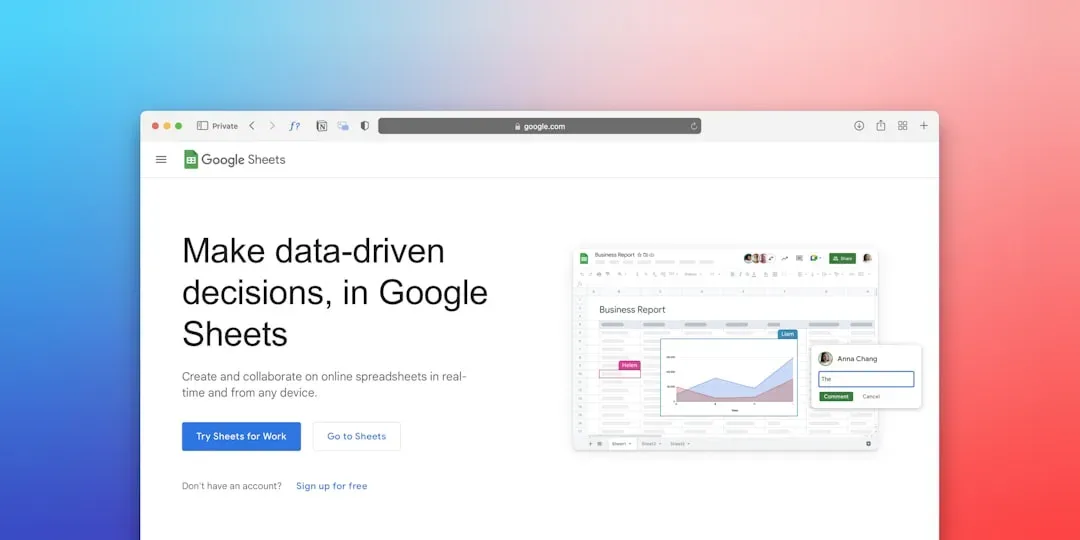
Choose tools that match your strengths: no-code tools like Tableau Public and Power BI get you a polished look quickly; code-first tools like Streamlit and Plotly Dash show off Python skills. Host code on GitHub and dashboards on free tiers (Tableau Public, Streamlit share) for live links.
Design principles: keep hierarchy clear—KPI header, top-line insight, drill-downs. Use color palettes accessible to colorblind users and provide tooltips. Include a short video walkthrough (1–2 minutes) so recruiters can see your narrative if they don’t interact directly.
Example tool stack A: SQL (SQLite for local queries) + Python (pandas) + Streamlit for deployment. Example tool stack B: Google Sheets + BigQuery + Looker Studio for cloud-friendly demos.
Statistic: Dashboards with short contextual narratives and a video demo increase click-through by about 40% on portfolio pages—so add narrative artifacts.
- Pick a primary visualization tool
- Maintain a clean GitHub repo and README
- Include a data dictionary and reproducible notebook
- Deploy a live demo (Tableau Public, Streamlit, Power BI)
- Create a short walkthrough video and embed it
| Tool | Pros | Cons | Best For | Learning Curve |
|---|---|---|---|---|
| Tableau Public | Polished viz, easy share | Limited privacy | Business dashboards | Low |
| Power BI | Microsoft ecosystem | Requires account | Enterprise charts | Low |
| Looker Studio | Free, Google data | Limited interactivity | Marketing reports | Low |
| Streamlit | Fast Python apps | Custom UI work | Data apps | Medium |
| Plotly Dash | Highly customizable | More code | Technical demos | High |
Finally, turn each dashboard into resume bullets: quantify impact (e.g., reduced analysis time by X hours, identified $Y in potential revenue), and prepare 2–3 interview talking points per project. Add next-step ideas like forecasting or simple A/B analyses to show growth potential.
Thanks for reading—if you want, start with one project: pick data, sketch the KPI header, and deploy a basic dashboard this week. Which project will you build first?
You now have a full roadmap to create beginner data analyst portfolio ideas focused on interactive dashboards: define stakeholder questions, scope a minimal viable dashboard, collect and clean data reproducibly, build and deploy a live demo, and document a clear case study that translates into resume bullets. My recommendation: pick one cross-functional project (like e-commerce sales + marketing funnel) and finish a deployable version—recruiters value polished, usable work over incomplete experiments. For each project, include a live link, a short video walkthrough, and a GitHub repo with notebooks and ETL code. Which dashboard will you publish first to dedensembada.com and share with your network?